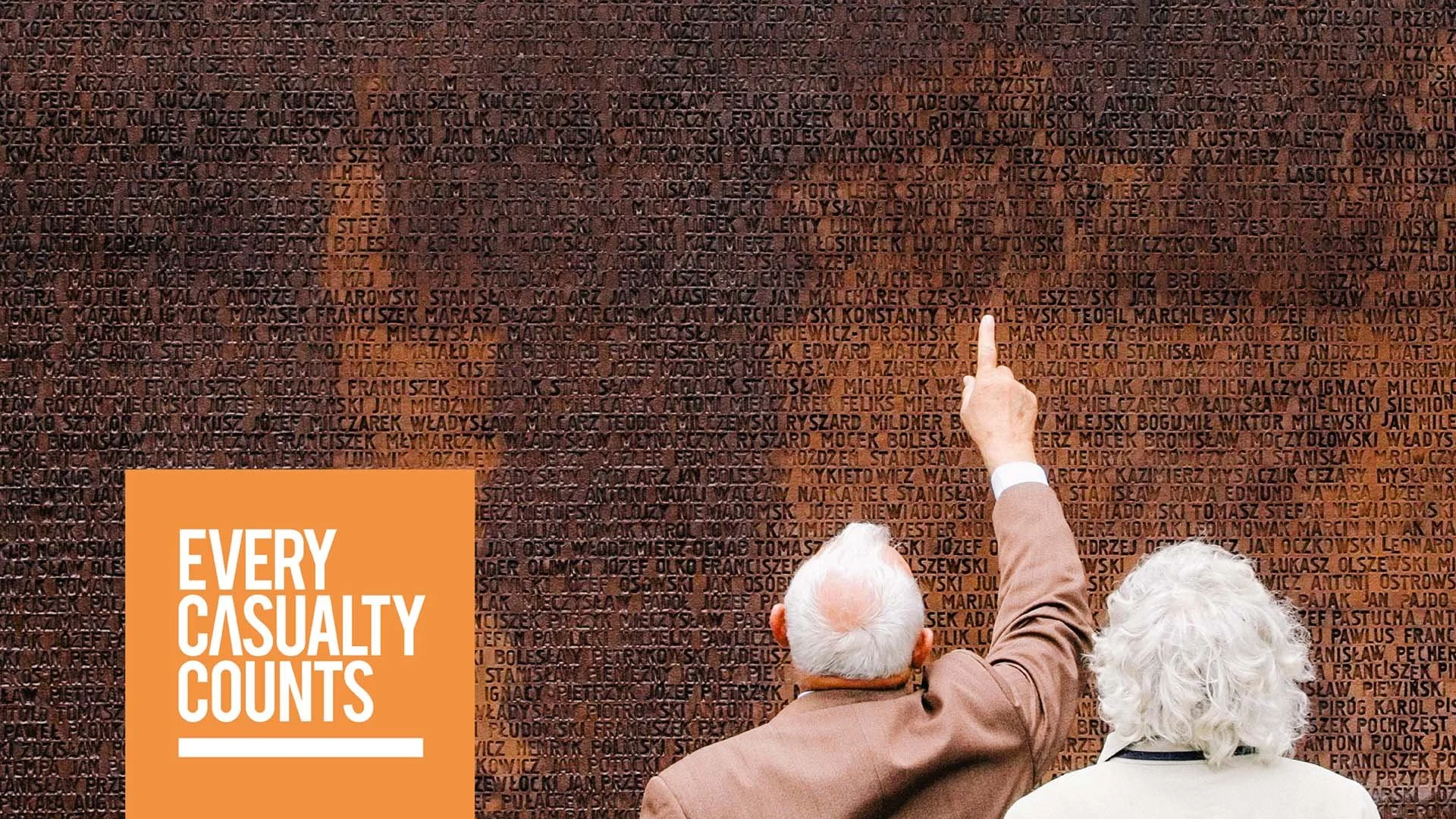
Some briefs demand more than good design. Every Casualty Counts is one of them.
An independent not-for-profit with more than a decade of experience promoting casualty recording in situations of armed violence, the organisation works with civil society, national governments, and the United Nations. The identity needed to be as rigorous, bold, and unambiguous as the evidence it advocates for: built on dignity, confidence, and the quiet authority that earns trust without demanding attention in the wrong way.
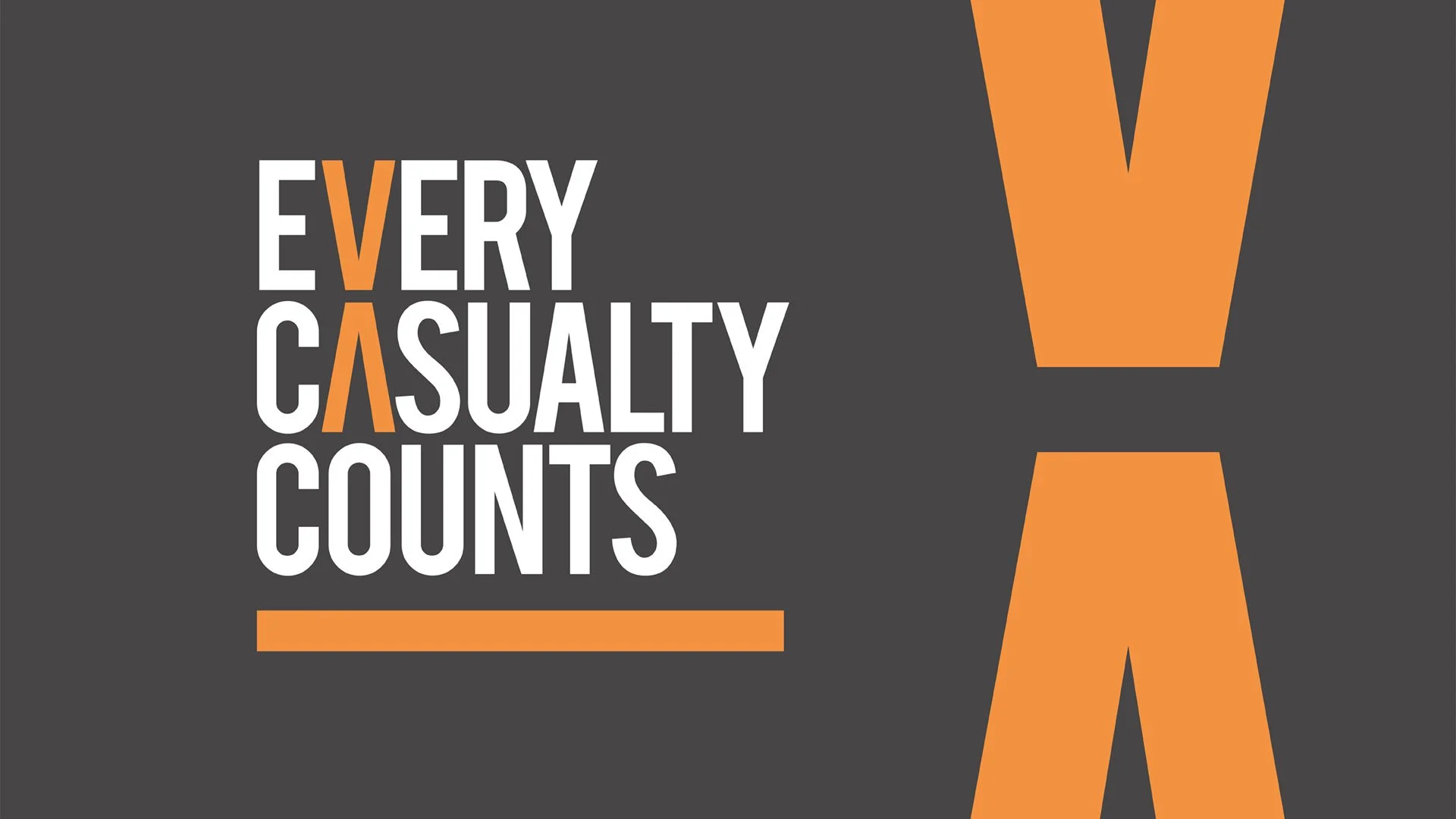
The solution is typographic at its core. Bold, condensed letterforms in white against deep charcoal, immediate and unambiguous. An amber accent isolates a shared geometry across the wordmark: the V in Every and the A in Casualty share the same angular form, united by colour into a single visual idea. The oversized X extends that thinking, a tally mark, a symbol that carries weight with restraint and purpose.
Every Casualty Counts. The identity says so without showing a single one.